Using Reflections
A reflection is a mirror image, optionally with its own mask. You can add a reflection to any visible HTML element. Reflections update automatically as the element’s appearance changes. If you hover over a link with a reflection, for example, you see the hover effect in the reflection. If you add a reflection to a video, the video plays in the reflection as well. Resize the element and the reflection is resized. Reflections are not interactive elements, however—clicking or touching a reflection does not generate any events.
Reflections have no effect on layout other than being part of a container’s overflow, and are similar to box shadows in this respect. In other words, you must position elements explicitly to allow space for reflections; if you add a reflection below an image, and follow the image with a paragraph of text, the reflection may cover the text (depending on the size of the image, padding, margins, and so on).
Adding a Reflection
Use the -webkit-box-reflect property to add a reflection to an element. The first, mandatory, parameter is the direction in which the reflection projects, which can be above, below, left, or right. For example, the following snippet adds a reflection below an h1 element, as Figure 3-1 illustrates:
<h1 style="-webkit-box-reflect: below;"> |
Reflection in Blue |
</h1> |
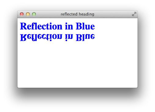
The reflection is the same visible size as the element. The element border and padding are included in the reflection.
Adjusting the Reflection’s Position
The first argument of the -webkit-box-reflect property specifies the direction of the reflection. An optional second argument specifies the offset or space between the original image and the reflection.
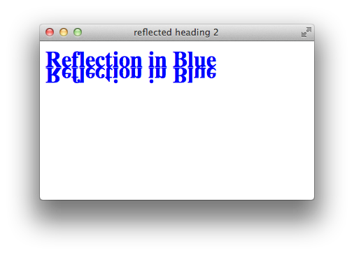
By default, the reflection begins with no separation from the element’s bounding box. To change this behavior, add an offset parameter. A positive offset causes the reflection to be separated from the element by additional space; a negative offset causes the reflection to overlap the element. For example, the bounding box of an h1 element includes substantial white space; to tuck the reflection in closer to the text, add a negative offset. The following example adds an offset of -15px to the reflection. The result is shown in Figure 3-1:
<h1 style = "-webkit-box-reflect: below -15px;">
Masking a Reflection
An optional third argument to -webkit-box-reflect specifies a mask to apply to the reflection.
A mask renders part of the reflection transparent or translucent. The mask is either an image file, specified as a URL, or a gradient. A mask image file can be a .png, an .svg, or a .gif with transparent areas. The alpha value of the mask is applied to the reflection on a pixel-by-pixel basis. Only the alpha value of the mask’s color values has any effect on the reflection.
When creating a mask, shape it to mask the target element itself, not to mask the reflection. The reflection shows a mirror image of the masked element, even though the element does not appear masked. The following snippet adds a mask image to a reflection. Figure 3-3 shows the resulting masked reflection side-by-side with the mask image.
style="-webkit-box-reflect: below 0px url(mask.png);"
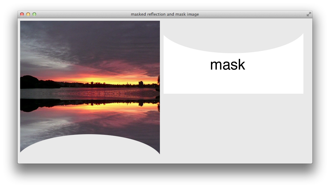

The following snippet adds a reflection below an image, using a gradient as a mask. Figure 3-4 shows the result.
<img src = "sunrise.png" style = " border-radius: 20px;
-webkit-box-reflect: below 0px
-webkit-linear-gradient(transparent, transparent 50%, white 90%);">
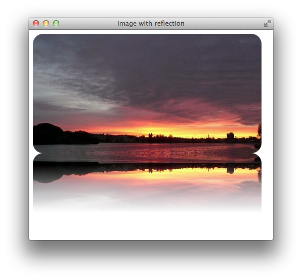
Note that the reflection includes the rounded borders of the img element. Notice also that the gradient goes from transparent at the top to opaque at the bottom—the opposite of its appearance in the reflection; this is because the reflection shows a mirror image of the masked element.
For more about masks, see Using Masks; for more about gradients, see Using Gradients.
Inner Reflections
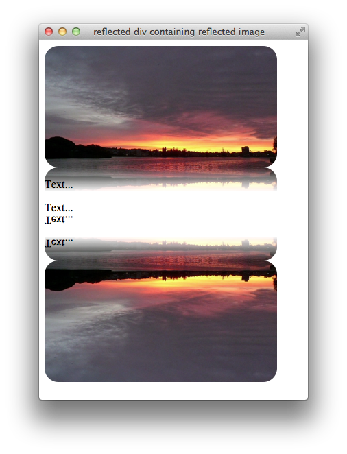
When you reflect an element, all of the element’s descendants are displayed in the reflection. If you add a reflection to a child element, the child’s reflection is rendered first; this inner reflection is included in the parent element’s reflection. The following snippet adds a reflection to a div element containing an img element that has its own reflection. Figure 3-5 shows the result:
<div style="-webkit-box-reflect: below;"> |
<img src = "sunrise.png" height="177" width="339" style = " border-radius: 20px; -webkit-box-reflect: below 0px |
-webkit-linear-gradient(transparent,transparent 80%,white);"> |
<P> |
<P>Text... |
<P>Text... |
</div> |
Copyright © 2016 Apple Inc. All Rights Reserved. Terms of Use | Privacy Policy | Updated: 2016-10-27