Using Gradients
Use gradients as color fills that blend smoothly from one color to another. Use a CSS gradient anywhere that you can use an image, such as for the background of an element, an element border, or a mask. Because gradients are resolution-independent and compact, a line or two of CSS can replace hundreds of kilobytes—or even megabytes—of graphic imagery. Unlike graphic images, gradients have no inherent size, and automatically expand to fill a container.
To create a gradient, specify a starting color and an ending color, and optionally intermediate colors and a direction. Safari supports two types of CSS gradients: linear and radial. This chapter describes both types of gradients. Safari 5.1 on the desktop and Safari on iOS 5.0 use the -webkit- prefix for specifying gradients, but otherwise conform to the 17 February 2011 working draft for CSS3 gradients: http://dev.w3.org/csswg/css3-images/.
Creating Linear Gradients
A linear gradient defines a color change along a specified line. Each point on the line has a particular color. The width of the line, perpendicular to the direction of the line, extends to the edges of the gradient’s container. You can use a linear gradient to fill any two-dimensional shape. By default, a linear gradient changes colors from top to bottom. For example:
background: -webkit-linear-gradient(aqua, white)
defines a linear gradient that starts as aqua at the top of the element and ends as white at the bottom of the element. The gradient fills the element completely, as Figure 1-1 illustrates.

If you specify intermediate colors between the starting and ending color, the gradient blends from color to color. For example:
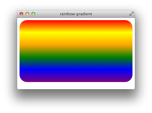
background: -webkit-linear-gradient(red, yellow, orange, green, blue, purple);
defines a rainbow gradient as a background. Apply this style to a div element, and the element is drawn with a rainbow background, as Figure 1-2 illustrates.
Setting the Direction of Change
You can define a linear gradient with the color change going in any direction: from any edge or corner to its opposite edge or corner, or at any specified angle. To specify a direction from edge-to-edge or corner-to-corner, just specify the beginning edge or corner. For example:
background: -webkit-linear-gradient(left, black, white);creates a horizontal gradient going from left to right.
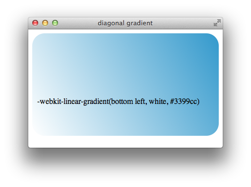
background: -webkit-linear-gradient(bottom right, black, white);creates a diagonal gradient from bottom right to top left.
You can also specify color change direction by supplying an angle. Angles are given in degrees, with 0deg being straight up and proceeding counterclockwise-positive so that 90deg is horizontal left and 180deg is straight down. For example:
-webkit-linear-gradient(45deg, black, white)
creates a gradient at a 45 degree angle up and to the left.
Figure 1-3 shows a diagonal gradient starting at the bottom left corner.
Setting the Rate of Change
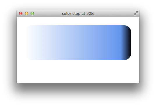
By default, the rate of color change for a gradient remains constant; if the gradient has three colors, the blend starts with the first color at 0% of the gradient length, reaches the second color at 50% of the gradient length, and reaches the third color at 100% of the gradient length. In other words, the first line of the gradient is the starting color, the middle line is the second color, and the last line is the third color. To modify this behavior, specify color stops. For example, the following snippet creates a gradient that changes gradually from white to cornflower blue over 90% of the gradient length and then blends quickly from to black over the remaining 10%:
-webkit-linear-gradient(left, white, cornflowerblue 90%, black)
Figure 1-4 shows such a gradient.
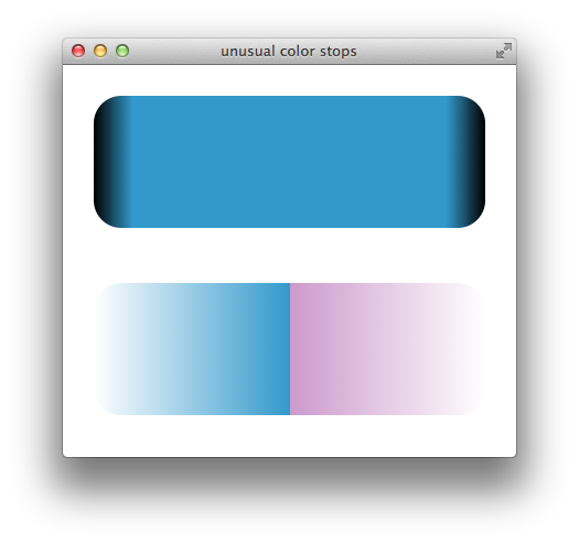
Color stops can create some striking effects. For example, specify the same color at two consecutive stops to create a band of solid color, or specify two different colors at the same percentage point to create an abrupt change in color. Figure 1-5 shows the effect these kind of color stops create.
background: -webkit-linear-gradient(left,black,blue 10%,blue 90%,black); |
background: -webkit-linear-gradient(left,white,blue 50%,purple 50%,white); |
Creating Gradient Fades
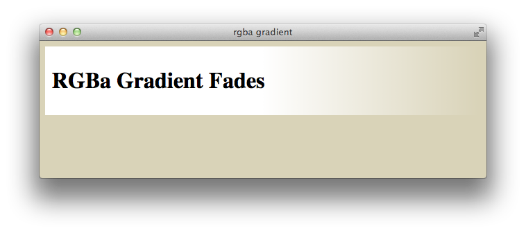
Use RGBa colors in a gradient to soften or fade colors into the background by decreasing the alpha value of the gradient. For example, Listing 1-1 creates a div element with a white background that fades to transparent. Two consecutive white color stops are used, so the div element’s background stays white for 50% of its width and then fades into the background of the element’s parent. Figure 1-6 shows the result.
Listing 1-1 Linear fade
<html> |
<head> <title>rgba gradient</title> </head> |
<body style="background: #d9d3b8"> |
<div style="background: -webkit-linear-gradient(left,white,white 50%,rgba(255,255,255,0)); |
padding: 10px 0px 10px 10px;"> |
<h1>RGBa Gradient Fades</h1> |
</div> |
</body> |
</html> |

Creating Radial Gradients
A radial gradient is a color fill that blends from one color to another with the color change proceeding radially, forming a disk clipped by the shape of the element. The disk can be a circle or an ellipse. Specify a starting and ending color, and optionally specify intermediate colors. The starting color begins at the center of the disk, and the color change proceeds outward until the ending color is reached, by default at the farthest corner of the element being filled.
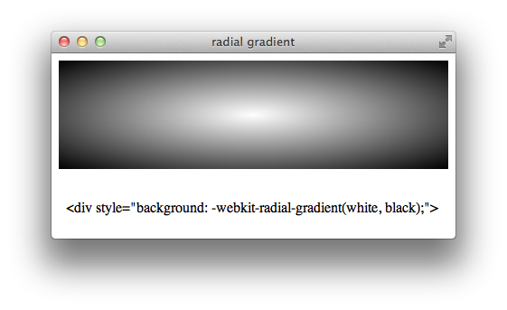
By default, a radial gradient is an ellipse the height and width of the element being filled, with the center of the ellipse at the center of the element being filled. For example, the following snippet creates a radial gradient that blends from white at the center of a div element to black at the element’s outer edges, as Figure 1-7 illustrates:
<div style="background: -webkit-radial-gradient(white,black);">
To create a circular gradient, pass in the circle parameter:
-webkit-radial-gradient(circle, white, black).
The circle parameter parameter causes the gradient to be circular, instead of an ellipse that conforms to the shape of the element, as Figure 1-8 illustrates:
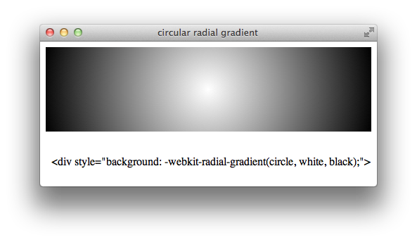
Note that the shape of an element clips a circular gradient just as it does an elliptical gradient.
Moving the Center
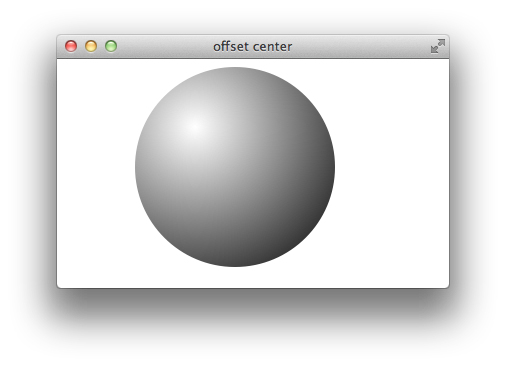
By default, the starting point of a radial gradient is the center of the element you are filling. Change this behavior by specifying a different starting point, using horizontal or vertical offsets from the element’s top left corner. The following example creates a circular div element (a square div element with a 50% border radius), then fills it with a radial gradient whose center is offset down and to the right of the element’s upper-left corner by 30%, creating a 3D lighting effect, as Figure 1-9 illustrates:
<div style="width: 200px; height: 200px; border-radius: 50%;
background: -webkit-radial-gradient(30% 30%, white, black);">
Notice that you specify the vertical and horizontal offsets are as a distance from the top and left edge of the element, and that you specify both offsets as part of a single comma-delimited parameter, separated by a space. If you specify only a single value, Safari treats it as a vertical offset.
Changing the Ending Color Location
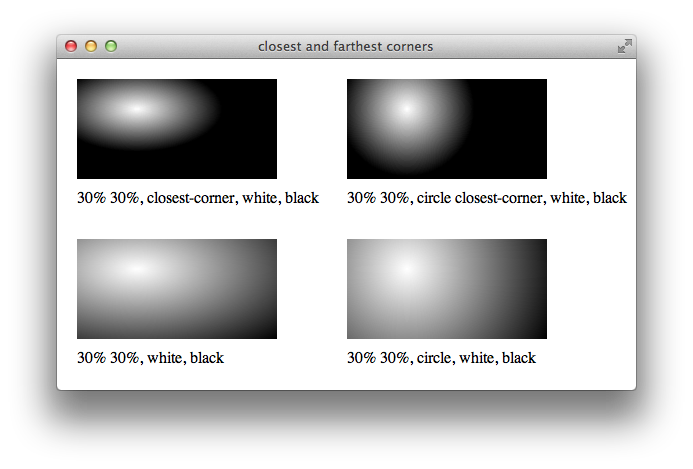
By default, a gradient reaches its ending color at the corner of the element furthest from the specified center of the gradient. Modify this behavior by specifying closest-corner. For example:
-webkit-radial-gradient(30% 10%, closest-corner, white, black)
creates a radial gradient that begins 30% to the right and 10% below the upper-left corner of an element, and reaches its end color at the closest corner.
If you specify both the circle and the closest-corner properties, pass them in the same comma-delimited parameter, separated by a space:
-webkit-radial-gradient(30% 10%, circle closest-corner, white, black)
When the gradient ends at the closest corner, the ending color fills the remainder of the element. Figure 1-10 shows examples of identical div elements filled with radial gradients offset 30% down and to the right of the upper-left corner. Elliptical gradients are on the left of the illustration and circular gradients are on the right. Closest-corner gradient fills are above and default gradient fills are below:

Adding Color Stops
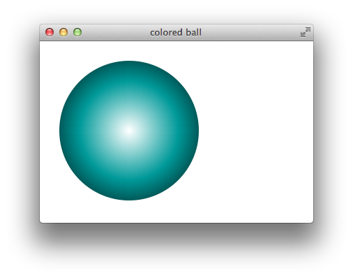
To create a multi-colored radial gradient, specify intermediate colors between the starting and ending color. For example, the following snippet creates a radial gradient that blends from white at the center to green half way out, to black at the outer edge, as Figure 1-11 illustrates:
<div style="width: 200px; height: 200px; border-radius: 100px;
background: -webkit-radial-gradient(white, green, black);">
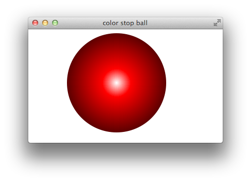
By default, the rate of color change is constant, dividing the gradient into equal-size color blends. Modify this behavior by providing color stops that specify the distance from the gradient center to its edge for particular colors. For example, the following snippet creates a gradient that blends from white to red in just 20% of the gradient, then takes the remaining 80% to fade to black, as Figure 1-12 illustrates:
<div style="background: -webkit-radial-gradient(white, red 20%, black);">
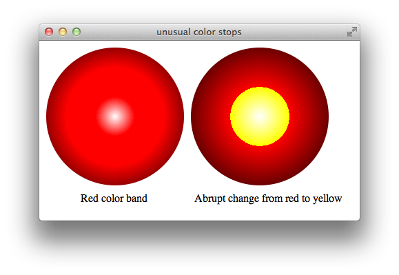
Specify paired color stops of the same color to create bands of solid color, or specify pairs of color stops with different colors at the same percentage point to create abrupt color changes. The following snippet defines two radial gradients, one with two color stops of the same color and the other with two differently colored stops at the same percentage point. Figure 1-13 shows the result:
background: -webkit-radial-gradient(white, red 10%, red 90%, black);
background: -webkit-radial-gradient(white, yellow 20%, red 20%, black);
Creating a Radial Fade
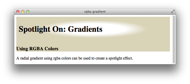
If you use RGBa colors in your color stops, you can specify both the hue and transparency of the gradient at any point. This enables you to create a gradient that blends into the background of its parent element. For example, Listing 1-2 creates a spotlight effect by fading a div element’s background from white to transparent, allowing the parent div’s background to gradually show through. Figure 1-14 shows the result:
Listing 1-2 Radial fade
<html> |
<head> <title>rgba gradient</title> </head> |
<body> |
<div style="background: #d9d3b8"> |
<div |
style="background: -webkit-radial-gradient(white,white 30%,rgba(255,255,255,0) 50%); |
padding: 10px 0px 10px 10px;"> |
<h1>Spotlight On: Gradients</h1> |
</div> |
<h3>Using RGBA Colors</h3> |
</div> |
<p>A radial gradient using rgba colors can be used to create a spotlight effect.</p> |
</body> |
</html> |

Creating Repeating Gradients
You can create a repeating pattern in a gradient in two different ways. One way is to specify a series of repeating color stops. For example, the following snippet creates linear and radial gradients with two repeating red-to-blue-to-red blend stripes:
-webkit-linear-gradient(red, blue 25%, red 50%, blue 75%, red)
-webkit-radial-gradient(red, blue 25%, red 50%, blue 75%, red)
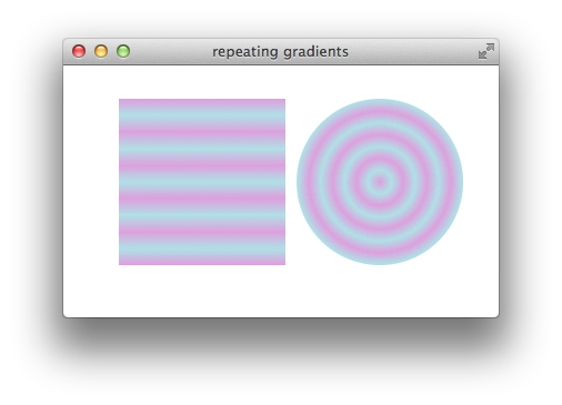
It’s tedious to specify the color stops repeatedly when there are many repetitions, particularly if you need to calculate cumulative percentages for each color stop. To simplify the process, use the repeating gradient properties: -webkit-repeating-linear-gradient and -webkit-repeating-radial-gradient. To create a repeating gradient, specify the first set of color stops with percentages; the gradient repeats the pattern of color stops, keeping the percentages proportional, as needed to reach 100%. The syntax for repeating gradients is otherwise identical to nonrepeating gradients. The following snippet specifies color stops that fill 20% of two gradients, which creates linear and radial gradients with five repeating plum-to-powderblue-to-plum blend stripes, as Figure 1-15 illustrates.
-webkit-repeating-linear-gradient(plum, powderblue 10%, plum 20%)
-webkit-repeating-radial-gradient(plum, powderblue 10%, plum 20%)
Note that the color pattern repeats from the starting color, so if the last color specified is the same as the starting color, the pattern repeats smoothly. If you specify a pattern whose last entry is different from the first entry, the color changes abruptly from the last color to the first color when the pattern repeats, instead of blending smoothly.
Using a Gradient as a Border Image
You can use a gradient anywhere you can use an image—as you would expect, this means you can use a gradient as a border image. However, the syntax is nonobvious. The border-image property uses four values to specify offsets for slicing the image into the top, bottom, and sides of the border. Since a gradient has no inherent size, a pixel or percentage offset into the image is meaningless; the only useful value is 100%.
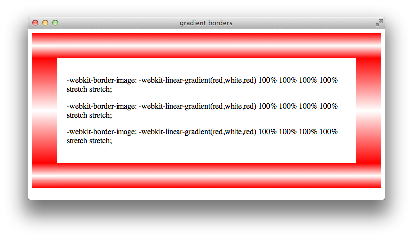
To make tiles from a linear gradient so that the border edges have the same color everywhere the tiles meet, start and end the gradient with the same color. For example, the following snippet creates a border like the one that Figure 1-16 shows.
<div style="border-width: 50px; border-style: solid;
-webkit-border-image: -webkit-linear-gradient(red, white, red) 100% 100% 100% 100% stretch stretch;">

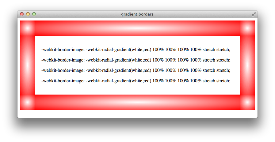
Radial gradients work nicely as borders, because the outer edges of all the tiles typically match when the stretch value is used for the repeat parameter.
Here is an example of a radial gradient used as a border image:
<div style="border-width: 50px; border-style: solid;
-webkit-border-image: -webkit-radial-gradient(white,red) 100% 100% 100% 100% stretch stretch;">
Figure 1-17 shows the result.

Prior Syntax (-webkit-gradient)
The -webkit-linear-gradient and -webkit-radial-gradient properties are supported in iOS 5.0 and later, and in Safari 5.1 and later on the desktop. In prior versions of Safari, both linear and radial gradients were implemented using the -webkit-gradient property. If you need to support earlier versions of iOS or Safari, use the -webkit-gradient property to create gradients. The syntax is as follows:
Specify linear gradients using the keyword linear, followed by a starting point, an ending point, a starting color with the keyword from, any color stops, and an ending color with the keyword to.
Linear gradient, vertical from top:
-webkit-gradient(linear, center top, center bottom, from(white), to(black))Linear gradient, horizontal from left:
-webkit-gradient(linear, center left, center right, from(white), to(black))Linear gradient, diagonal from upper left:
-webkit-gradient(linear, upper left, lower right, from(white), to(black))Linear gradient, rainbow:
-webkit-gradient(linear, center left, center right, from(yellow), color-stop(20%, orange), color-stop(40%, red), color-stop(60%, green), color-stop(80%, blue), to(purple))
Specify radial gradients using the keyword radial, followed by a starting point, a starting radius, an ending point, an ending radius, a starting color, any color stops, and an ending color.
Radial gradient, centered:
-webkit-gradient(radial, center center, 0px, center center, 100%, from(white), to(black))Radial gradient, offset:
-webkit-gradient(radial, 20% 20%, 0px, 20% 20%, 60px, from(white), to(black))Radial gradient, rainbow:
-webkit-gradient(radial, center center, 0px, center center, 100%, from(yellow), color-stop(20%, orange), color-stop(40%, red), color-stop(60%, green), color-stop(80%, blue), to(purple))
The beginning radius specifies the size of the disk at the center of the gradient. The ending radius specifies the size of the disk at the end of the gradient. The gradient is circular if the beginning and ending center points are the same, elliptical otherwise. The gradient is clipped by the shape of the containing element if the ending radius specifies a larger disk than the element can contain.
Copyright © 2016 Apple Inc. All Rights Reserved. Terms of Use | Privacy Policy | Updated: 2016-10-27