Three steps to make your app shine on iPhone Duo
Apps built with the iOS 27 SDK and later resize dynamically on iPhone Duo. Unfold it and your app expands to fill the inner display; fold it and your app returns to the outer display. Hardcoded screen sizes, fixed orientations, and device assumptions can break layouts, leading to stretched, clipped, or misplaced content. Follow these steps to make sure your app is ready for iPhone Duo.
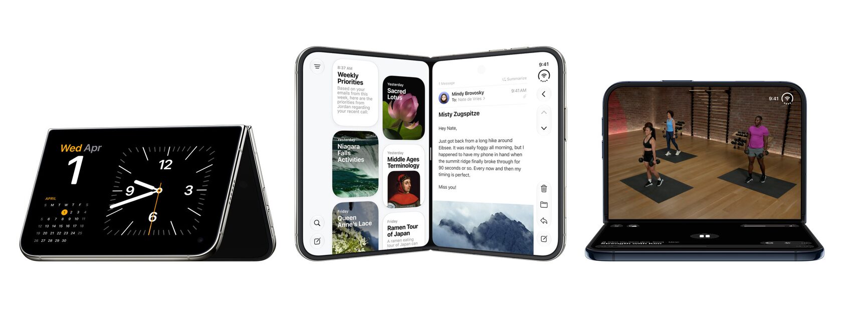
Before you begin
While all apps will run on iPhone Duo, building with the latest SDKs let your app use more of the display and adapt gracefully across layouts. The following examples show what your app will look like on iPhone Duo depending on which SDK you build with.
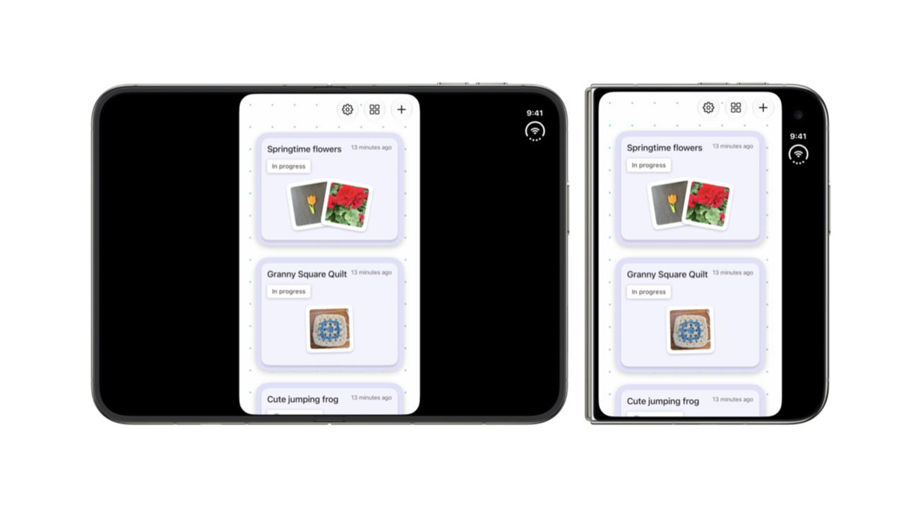
iOS 26 SDK
Apps built with the iOS 26 SDK or earlier run on iPhone Duo, but won’t adapt to all layouts. When the device is open, your app will appear in the center of the display, with empty space surrounding the window. When the device is closed, the outer display will show your app’s content to the left of the status bar and camera.
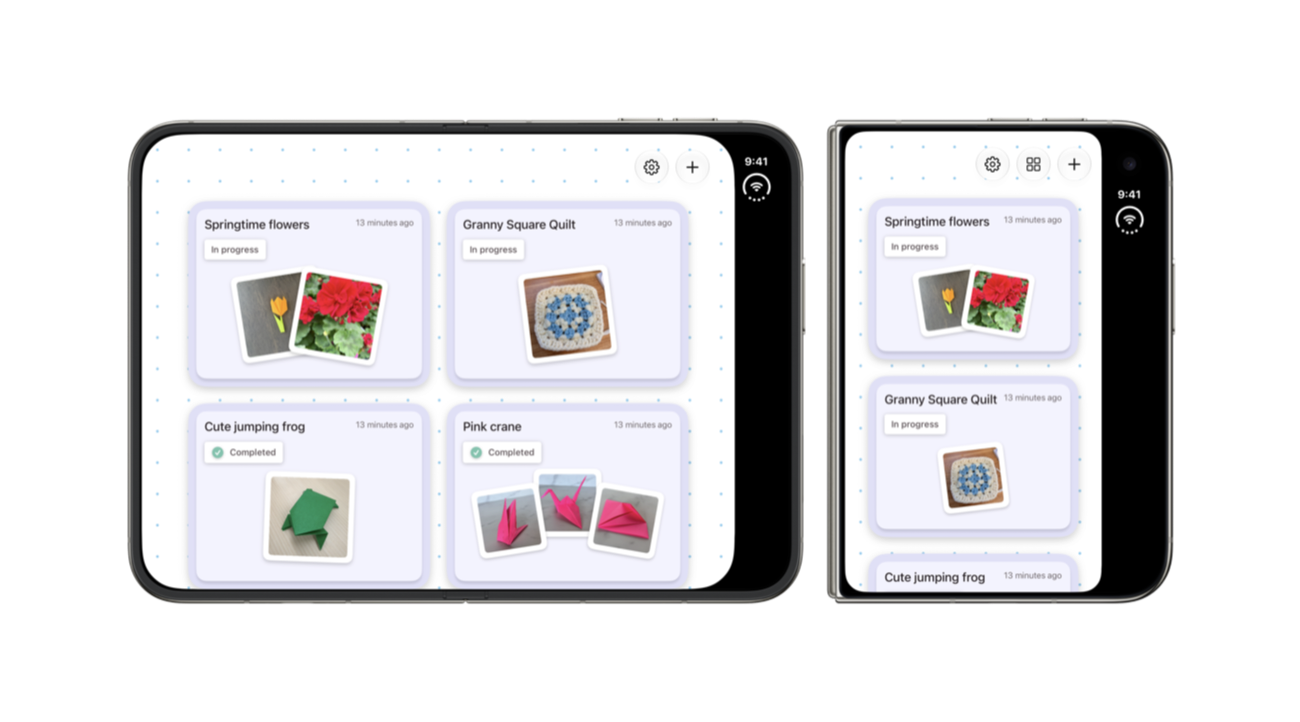
iOS 27 SDK
Apps built with the iOS 27 SDK resize to fill most of the inner display on iPhone Duo, but still avoid the status bar on the right edge. This provides an improved experience, as empty space is minimized.
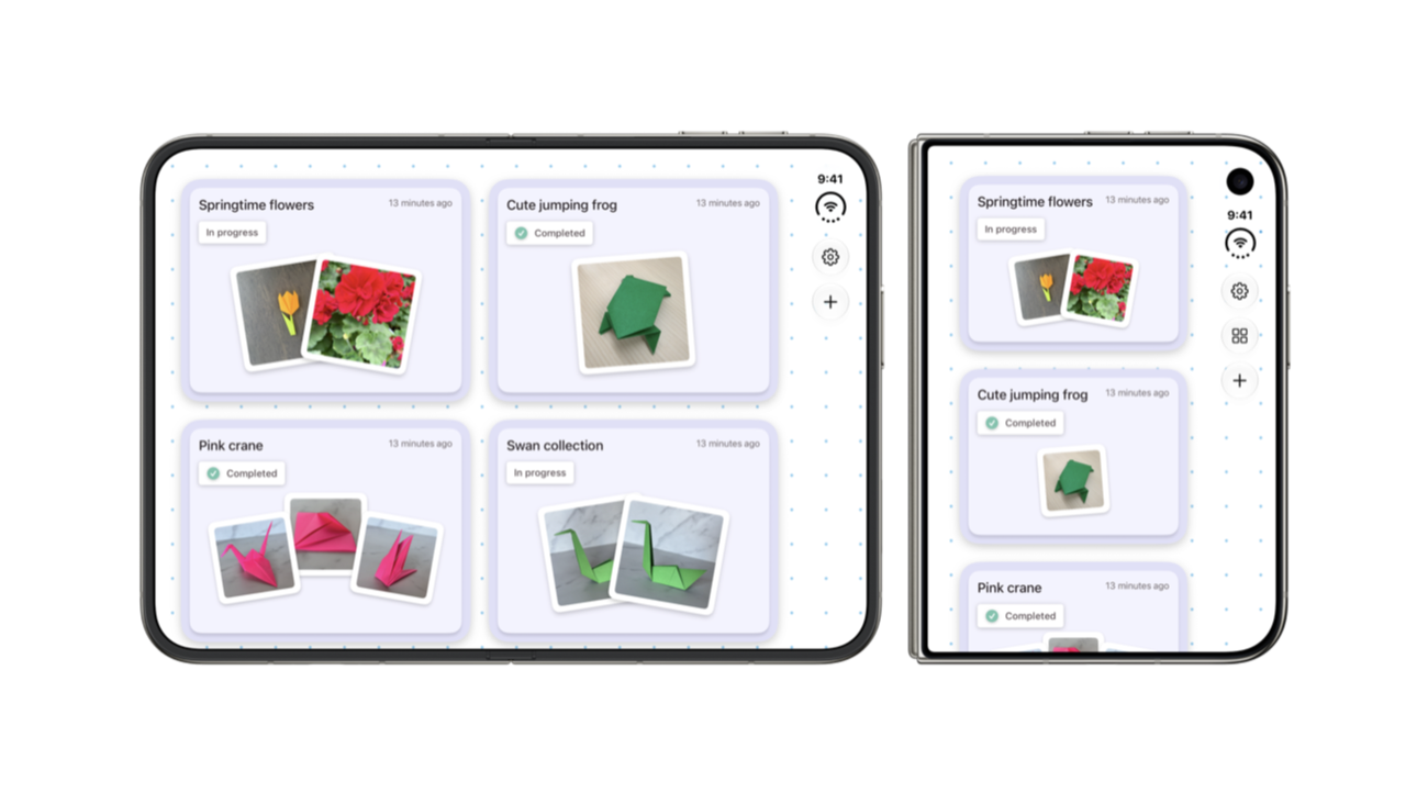
iOS 27.1 SDK or later
Apps built with the iOS 27.1 SDK or later are optimized for iPhone Duo. Apps will extend to use the full display, with toolbars and tab bars appearing vertically below the status bar. This provides people with an optimal and consistent experience as they move across displays.
Before shipping an app build with the iOS 27.1 SDK, make sure your app’s content adapts to the bars becoming vertical.
Step 1: Run the app resizability skill
In Xcode, ask the coding assistant to “get my app ready for iPhone Duo.” The skill scans your project for the patterns described in Step 2. For each issue it finds, it explains the problem and suggests a fix.
If you use a different coding agent, export the skill by running this in Terminal:
xcrun agent skills exportThe skill finds most issues, but not all of them. Use the list below to review what it flags and catch anything it misses.
Step 2: Fix patterns
Stop sizing from the main screen
On iPhone Duo, your app’s size changes whenever the device folds or unfolds, and it doesn’t always match the size of the screen. Search your project for UIScreen.main and replace each use:
- Size from the view or window. Replace
UIScreen.main.boundswithview.boundsorwindow.bounds. In SwiftUI, useGeometryReaderoronGeometryChange. - Re-read the size whenever it changes. Reading the size once at launch or in
viewIsAppearingisn’t enough, because a fold can resize your app in the middle of a session. Do size-dependent layout inlayoutSubviewsorviewDidLayoutSubviews, and useviewWillTransition(to:with:)for work that needs to run when the size changes. - Get scale from the trait collection. Use
traitCollection.displayScalein UIKit or@Environment(\.displayScale)in SwiftUI. - Create windows from a scene. Replace
UIWindow(frame: UIScreen.main.bounds)withUIWindow(windowScene:). - Don’t store a
UIScreen. When screen information is needed, access it dynamically withview.window?.windowScene?.screen.
Avoid using orientation to make layout decisions
On iPhone Duo, the device’s orientation doesn’t tell you what shape your app is. Search for these properties and remove any layout logic that depends on them:
UIDevice.current.orientationstatusBarOrientationinterfaceOrientation, includingwindowScene.effectiveGeometry.interfaceOrientation.
To find out whether your app is wider than it is tall, compare the width and height of the space you have: view.bounds in a view controller, superview.bounds in a view, or the size from GeometryReader in SwiftUI.
Stop assuming idiom or size class identifies the device
With iPhone Duo and resizable iPhone Mirroring, an iPhone app can have any combination of size classes. On the inner display, your app should look like a natural extension of its iPad layout. For more information, see Prepare your app for iPhone Duo.
- Don’t choose a layout by idiom. Search for
userInterfaceIdiom == .phoneand== .pad. Base layout choices on size classes or available space instead. - Don’t treat “regular width” as “iPad.” Code that shows an iPad-only layout when
horizontalSizeClass == .regular, or that assumes iPhone is always compact, will now run that layout on iPhone too. - Remove checks for specific device sizes. Comparisons such as
bounds.height == 844or a list of known iPhone sizes won’t match iPhone Duo. - Check full-bleed media. Hero images and video set to
.scaleAspectFillor.aspectRatio(contentMode: .fill)can lose important content on wider displays. Use the current size classes or aspect ratio to choose between fill and fit, or set a focal point.
Step 3: Test resizing
Test resizing using these tools to make sure your app runs as expected.
- The iOS resizable simulator in Device Hub.
- iPhone Mirroring on macOS 27. Resize the window to extreme sizes in both directions.
- The iPhone Duo simulator in Xcode 27.1.
- Note: The iPhone Duo simulator is the best way to test the full native experience.
Go further: Stand out on the App Store
Update your App Store product page to show that your app is ready for iPhone Duo.
Showcase iPhone Duo support. Share app previews and screenshots that highlight your app across orientations. View screenshot specifications.
Preview your assets. Use the new preview tool in App Store Connect to see how your assets — including new creative assets — look on iPhone Duo.
Share your app with us. Submit a featuring nomination in App Store Connect to let the App Store editorial team know your app supports iPhone Duo. In the Helpful Details section, you can specify that your app is optimized for iPhone Duo, including support for all device poses. Learn how to create a featuring nomination.