

-
在 iPhone Duo 上提升控制栏的体验
了解如何针对 iPhone Duo 独特的显示屏适配你的导航、工具栏和标签页栏。探索全新栏布局背后的设计原则,并学习如何配置自定视图表现形式以及管理溢出内容,从而构建功能强大且响应迅速的 App。
章节
- 0:00 - Introduction
- 0:28 - Why bars move to the side
- 1:29 - Agenda
- 2:00 - Opt in to vertical bars
- 3:09 - Understand the shared bar region
- 4:29 - Order items in a vertical bar
- 5:56 - Prepare toolbar content
- 8:00 - Control the axis of an item
- 9:00 - Prefer symbol-only items
- 10:07 - Adapt custom views
- 11:40 - Manage the overflow menu
- 13:10 - Prioritize item visibility
- 14:21 - When to opt out
- 14:53 - Next steps
资源
相关视频
Tech Talks
WWDC26
WWDC25
-
搜索此视频…
大家好, 我是安娜,是 UI 框架团队的一名工程师。 我是玛丽亚,一名从事 Apple 设计系统工作的人机界面设计师。 等等,我为什么会在这里? 每位设计师都是工程师,每位工程师都是设计师。 要想打造出色的应用,你必须兼顾这两方面。
今天,安娜和我将教你如何 在 iPhone Duo 上 提升你的界面条标准。
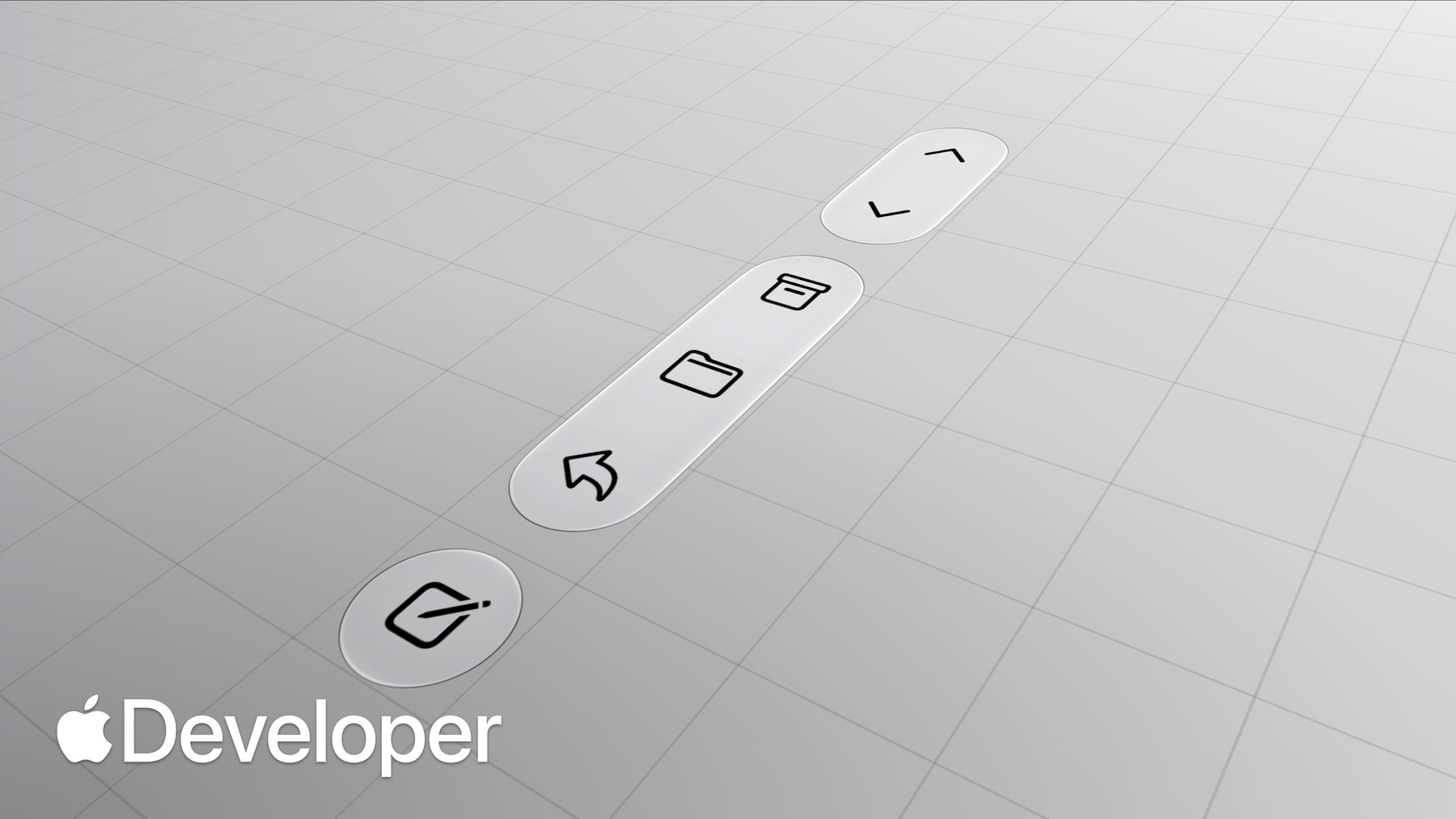
iPhone Duo 是苹果 首款多屏 iPhone, 让用户能够根据当下需求自由选择使用方式。 你会立刻注意到,它与众不同, 呈现出一种崭新而独特的轮廓。 而这种形状至关重要。 更宽的纵横比为你的应用 提供了更多的横向空间。 为了充分利用这一宽度并为内容保留垂直空间, 通常位于顶部和底部的控件被移至侧边, 这样操作 起来也更方便。 这种新设计最大限度地 扩大了外屏上垂直内容的显示空间。 当你将 iPhone Duo 展开至内屏并切换为横屏模式时, 这些控件的位置保持不变。 但当你将设备竖屏展开时, 较大的屏幕会恢复 为熟悉的 iPhone 布局, 显示横向状态栏。 请记住,这些都是相同的组件, 只是适应了不同的布局。 既然您已经理解了背后的原理, 以下是在 iPhone Duo 上设计和实现出色工具栏体验时需要注意的几点。
首先,我们将帮助您适应新的轴向, 并在 iPhone Duo 上将 工具栏设置为垂直显示。 接下来,我们将讨论 项目排序以及它们与不同容器的交互方式。 之后,我们将分享如何针对垂直轴 定制工具栏内容。 最后,我们将重点介绍如何管理溢出菜单。 不过安娜,在深入探讨之前, 我能向你展示我一直 在开发的这款应用吗?当然可以。 我已经完成了使其支持尺寸调整的工作。 但是,我的工具栏仍然是水平的。 是我漏了什么吗?
我明白你的意思了,玛丽亚。 要让你的应用采用新的工具栏行为, 你需要做几件事。 首先, 使用最新的 SDK 重新构建你的应用。 现在,玛丽亚的应用已经准备好支持 iPhone Duo 了。 关于重新构建后 还会启用哪些其他行为, 请参阅“为 iPhone Duo 做好应用准备”。接下来, 请确保你使用的是 TabView 或 NavigationStack 等导航 容器提供的工具栏。 在 SwiftUI 中,请将工具栏修饰符 与 NavigationStack 或 NavigationSplitView 等 容器搭配使用。 在 UIKit 中,建议优先使用 UINavigationController 和 UITabBarController, 它们会自行管理相应的工具栏。 例如,应在视图控制器上设置工具栏项目, 然后将其放入导航控制器中, 而不是创建自定义的 UIToolbar。 若用于构建自定义工具栏, 则 UIToolbar、 UINavigationBar 或 UITabBar 等子组件的内容将不予考虑。 既然您已经了解了如何 在应用中让工具栏垂直移动, 接下来我将深入探讨其内容的布局方式。
iPhone Duo 允许导航控件、 工具栏和标签栏控件在同一共享区域内共存。 一个有帮助的理解方式是,将其想象成旋转 90 度后形成的垂直堆叠结构。 根据您的布局不同, 其中可能包含这些控件的不同组合。 例如在“备忘录”中,布局使用工具栏; 而在“时钟”中,布局则包含标签栏。 而在“健身 ”应用中,布局同时使用了工具栏和标签栏。 在更复杂的布局中, 只有当工具栏项的容器位于 显示屏边缘时,这些项才能垂直移动。 在分屏视图中,仅“详细 信息”列会参与垂直移动。 其他列中的项仍保持水平排列。 此外,由于详细信息列本身已包含垂直栏, 因此展开时检查器不会 显示独立的垂直栏,以避免混淆。
在外屏上,如果你的弹出视图已包含工具栏, 则该工具栏将垂直显示。 在内屏上,工具栏默认居中, 且项目保持水平排列。 当你使用 `preferredPlacement` API 更改其位置时,放置 在左侧的弹出视图不会显示垂直栏, 而放置在右侧的弹出视图则会显示垂直栏。 由于该栏与硬件对齐,因此在 从右到左的语言环境中, 它始终位于设备的同一侧。 内容会围绕该栏进行自适应布局, 而栏本身保持固定。
总而言之,尽管您可能想为所有 控件更改轴向, 但请保持它们与容器的关联。 在垂直显示时, 项目会保持清晰的自上而下的层级结构。 首先检查现有的工具栏配置, 确保控件遵循推荐的顺序。 将顶部位置留给主要导航控件(如“ 返回”或“关闭”), 随后是醒目的操作按钮(如“完成”)。 若使用导航控制器, “返回”按钮会自动添加。 对于自定义的“返回”或“关闭”按钮, 请在 SwiftUI 中使用 cancellationAction 布局。 而在 UIKit 中, 请使用“领先项目”(leading item ),并确保 `leftItemSupplementsBackButton` 设置为 `false`(这是默认值)。 `leftItemSupplementsBackButton`? 是谁给这个 API 起的名字? 肯定不是我。
对于突出显示的操作,请 在 SwiftUI 中使用 `topBarPinnedTrailing` 布局, 或在 UIKit 中 使用 `pinnedTrailingGroup` 布局。 其余项目将保留其原始分组, 即使合并为单个工具栏,顶部和底部 布局之间也会通过 垂直间隔符在视觉上分隔开来。 请记住,并非所有姿态都会将工具栏垂直布局。 请保持控件布局的一致性, 这样用户在使用 iPhone Duo 时就无需重新学习操作按钮的位置。 既然您已经了解了项目的布局位置, 接下来让我们确保您的工具栏内容已准备就绪。
您可能对水平排列项目的工具栏比较熟悉。 现在, iPhone Duo 将这种布局横向翻转了。 与水平工具栏不同——水平工具 栏中项目高度固定而宽度灵活, 垂直工具 栏则允许项目高度灵活而宽度固定。 这使得垂直工具栏 更适合仅用图标表示的项目。 通常, 您的应用会在工具栏内容中指定两 项数据:图标和标题。 系统会根据上下文以及项目中指定的内容, 选择显示哪种形式。 当项目在现有的顶部和底部工具栏中可见时, 系统会优先显示图标,例如这里的分享按钮。 如果没有图标, 例如编辑按钮,则会显示文本。 当项目移入溢出菜单时, 系统会同时显示标题和图标。 这些规则在垂直工具栏中保持不变。 你仍然需要指定相同的内容, 并将相同的项目放置在水平栏中。 不同之处在于,系统现在 还会考虑你的内容更适合放置 在垂直轴还是水平轴上。 带有图标的项目(如返回和分享
按钮)会将轴向切换为垂直。 而仅含文本的项目(如编辑 按钮)则继续保持在水平轴上。 如果你已经通过 SwiftUI 标签或 UIBarButtonItem 的属 性来设置标题和图片, 那么你已经为使用垂直栏做好了充分准备。 通常, 你应预先提供项目的所有信息, 并让系统根据上下文选择合适的呈现方式。 这意味着,即使你的内容是一张图片, 提供标题依然非常重要。 就像水平栏一样, 每当项目移入溢出菜单 或展开形式时,系统都会使用该标题。 默认情况下, SwiftUI 和 UKit 会根据内容推断项目的放置位置, 例如项目是纯文本还是 带文本的图标。
如果你需要调整此默认行为,可以使用 新的 AxisBehavior API。 你可以在几种不同的情况下使用它。 相关项目应保持在同一轴线上。 一个常见的示例是会在图标 和文本之间切换的项目, 例如“时钟” 应用中的这个编辑按钮。 该项目不应被放置在垂直栏中, 尽管从理论上讲, 图标可以垂直显示。 如果你使用的是系统编辑按钮,则无需担心。 它会自动保留在水平栏中。 如果你正在创建一个 在符号和文本之间切换的自定义控件, 请使用“仅水平轴”行为, 就像这个自定义选择按钮一样。 另一方面, 如果你的视图是 UKit 中的自定义视图或复杂视图, 系统会将其保持为水平布局。 如果你的自定义视图确实支持垂直 显示(例如右上角的罗盘视图), 请将“首选垂直轴 ”行为设置为允许其进入垂直栏。
尽量减少仅显示标题的项目, 或同时显示文本和图片的自 定义视图,以便更多内容能垂直排列。 在大多数 情况下,这些项目非常适合使用符号表示形式。 例如,与其将计数保持在内联显示, 我可以在收件箱上使用徽章, 将同时显示文本和符号的项目转换为仅 显示符号的项目, 这样它就能自然地融入垂直栏中。 如果您尚未使用 iOS 26 中新增的徽章 API, 请采用该 API 以在所有设备上 获得符合系统标准的徽章外观。 评估自定义视图是否需要文本的一个有效 方法是自问:它只是对图标的补充, 还是承载了独立的信息? 如果文本仅起补充作用, 仅靠图标就能清晰传达操作意图。 但是,如果文本确实包含有意义的信息 (例如显示金额的购物车按钮), 则最好将该控件保留 在水平栏中。 最后,辅助栏应保持与键盘关联, 而非移至垂直轴上。
自定义视图需要额外的工作 才能准备好进行垂直布局。 在选择要显示的项目时, 请确保它们要么适合栏的固定宽度, 要么具有垂直适配的布局。 请考虑是否需要针对垂直显示调整相关参数。 例如,此自定义操作面板在垂直显示 时会隐藏标题并略微缩短高度, 以便为其他内容腾出更多空间。 特别是对于自定义视图, 当出现垂直工具栏时,您可能需要进行相应调整。 要判断此情况,请读取 `toolbarVerticalEdge` 环境 属性或特质。您可以在内容视图中或 项目自定义视图内读取该属性。 当项目可位于垂直轴上时, 该值会被填充;当不可位于垂直轴上时, 该值为 nil 或未指定。 与水平条一样, 垂直条默认不具有滚动边缘效果。 但是,当启用了“ 降低透明度”辅助功能设置时,它会有背景。 请确保您的自定义视图内容 在任何情况下都保持可读性。 默认情况下,弹性间隔符在垂直轴上的大小为零。 但固定间隔符会继续保持其最小尺寸。 无论条形是水平还是垂直, 您的应用都不应额外添加间距。
Maria, 你在 WWDC25 的视频中 不是提到过这一点吗? 是的,我确实提到了。 感谢观看。
如果您的应用尚未将条形更新为新设计, 或尚未根据首尾边缘对单个项目 进行分组, 现在正是最佳时机。
最后,让我们谈谈溢出管理。 在横屏模式的外屏上, 项目更容易溢出, 仅仅是因为垂直空间较少。 当其他竞争性 UI 出现 时(例如键盘, 或在竖屏模式 下使用画中画功能),工具栏也可能需要溢出。 首先要决定的是,工具栏项目和标签 栏哪个应该保持更长时间的可见。
在以导航为中心的体验 中(例如此“ 播客”视图),工具栏会 优先压缩,以便主要目标保持可访问。 这是默认行为。 在以任务为导向的体验 中(例如“游戏”应用 中的此视图),标签 栏会优先压缩,以保留频繁访问的操作。 请使用 toolbarCompressionBehavior API 为 每个视图配置 应用的偏好设置。在此基础上, 工具栏还需要更多考量。 随着需要管理的项目增多, 您还需要优先考虑哪些内容应保持可见。 如果您的应用已有自己的溢出菜单, 请将其操作整合到一个由系统管理的菜单中。 您可以在 SwiftUI 中使用 `ToolbarOverflowMenu`, 或在 UKit 中使用 `additionalOverflowItems` 来实现这一点。 并且,并非所有现有菜单都应成为溢出菜单。 省略号是 iPhone 上的标准溢出符号。 请将其保留用于此目的, 不要引入其他平台的符号, 并为其他菜单设置独特的符号。 为了让正确的内容保持更长时间的可见, 请务必向系统明确表达你的偏好。
如果你已将标签栏设 为优先级,或者工具栏超出了可用空间, 项目将开始移入溢出菜单。 工具栏可见性优先级可让你 精细控制哪些项目保持可见。
默认情况下,项目会从下往上溢出, 但您也可以为每个项目分配“高”、 “低”或自定义 优先级,以控制它们折叠的顺序。 在项目内部,请先按组设置优先级。 然后,如有需要, 再为每个组内的项目设置优先级。 使用 SwiftUI 和 UKit 中的 visibilityPriority API 来配置 此优先级。 并查看 WWDC26 中 SwiftUI 的新功能以了解更多信息。 在设置可见性优先级时, 请考虑用户最常需要访问的项目。 像“邮件”中的“撰写”或“备忘 录”中的“新建备忘录”这类高频操作, 应尽可能晚地移入溢出区域。 同样,用于传达重要状态的控件( 例如带有徽章的项目 )应保持更长时间的可见性, 以确保一目了然。 Maria, 我现在明白 为什么状态栏采用垂直布局了, 但它们真的应该在所有地方都垂直排列吗?
大多数应用都适合采用这种布局。 不过,在某些情况下, 你的应用可能需要禁用此行为。 如果你的应用是像“计算器”那样 底部内容较多的单页应用,请考虑采用水平布局, 以便内容能够完全展开。 同样,如果一个弹出视图中 控件较多且仅有一个项目( 例如此处的关闭按钮), 请考虑禁用垂直栏,以免占用可用空间。 请使用 `toolbarVerticalBehavior` 和 `preferredVerticalBarBehavior` API 来禁用 此功能。
这一切始于一个非常简单的问题。 如果状态栏不必始终位于顶部和底部呢? 剧透一下:它们移动了。 移到了侧边。 其实也没移多远。 这样既能让内容区域显得宽敞, 又能确保控件触手可及。 同样熟悉的体验, 却造就了一款全新的 iPhone。 要让您的应用做好准备, 第一步是使用最新的 SDK 构建应用。 检查应用中的状态栏, 确保它们已为新设计做好准备。 更新所有自 定义控件,使其支持垂直布局。 并确保设置溢出优先级, 以便系统能够灵活适应。 还有其他事项吗? 都在溢出菜单里。 我们很快再见!
-
-
2:24 - Use system containers for vertical bar in SwiftUI
var body: some View { NavigationStack { ContentView() .toolbar { ToolbarItem(placement: .bottomBar) { ... } } } } -
2:39 - Use navigation containers for vertical bar in UIKit
// Content from a custom bars (UINavigationBar, UITabBar, UIToolbar) // won't be considered. Prefer UINavigationController // and UITabBarController, which manage their own bars. let toolbar = UIToolbar() toolbar.items = [...] -
5:00 - Place a back or close button
// SwiftUI .toolbar { ToolbarItem(placement: .cancellationAction) { ... } } // UIKit navigationItem.leftItemsSupplementBackButton = false navigationItem.leadingItemGroups = [UIBarButtonItemGroup(...)] -
5:24 - Place prominent actions
// SwiftUI .toolbar { ToolbarItem(placement: .topBarPinnedTrailing) { ... } } // UIKit navigationItem.pinnedTrailingGroup = UIBarButtonItemGroup(...) -
8:08 - Set a preferred axis for a custom view
// SwiftUI var body: some View { ContentView() .toolbar { ToolbarItem { ProfileView() } .axisBehavior(.verticalPreferred) } } // UIKit let item = UIBarButtonItem(customView: ProfileView()) item.axisBehavior = .verticalPreferred -
8:36 - Keep an item in the horizontal bar
// SwiftUI var body: some View { ContentView() .toolbar { ToolbarItem { SelectOrDoneButton() } .axisBehavior(.horizontalOnly) } } // UIKit item.axisBehavior = .horizontalOnly -
8:52 - Allow a custom view go in vertical bar
// SwiftUI var body: some View { ContentView() .toolbar { ToolbarItem { CompassView() } .axisBehavior(.verticalPreferred) } } // UIKit let item = UIBarButtonItem(customView: CompassView()) item.axisBehavior = .verticalPreferred -
9:27 - Use badges
// SwiftUI var body: some View { ContentView() .toolbar { ToolbarItem(...) { InboxButton() .badge(7) } } } // UIKit let item = UIBarButtonItem(...) item.badge = .count(7) -
10:36 - Read the vertical bar edge
// SwiftUI struct ContentView: View { @Environment(\.toolbarVerticalEdge) var edge var body: some View { switch edge { ... } } } // UIKit switch traitCollection.verticalBarEdge { ... } -
12:23 - Configure toolbar compression behavior
// SwiftUI var body: some View { TabView { Tab("Recents", systemImage: "clock") { ContentView() .toolbarVerticalCompressionBehavior(.prefersToolbarItems) } } } // UIKit navigationItem.verticalBarCompressionBehavior = .prefersBarItems -
12:43 - Use system overflow menu
// SwiftUI var body: some View { ContentView() .toolbar { ToolbarOverflowMenu { Button("Scan") { ... } Button("Connect") { ... } } } } // UIKit navigationItem.additionalOverflowItems = UIDeferredMenuElement({ provider in provider(self.persistentOverflowItems()) }) -
13:21 - Set item visibility priority
// SwiftUI var body: some View { ContentView() .toolbar { ToolbarItem { Button(...) { ... } } .visibilityPriority(.high) } } // UIKit let item = UIBarButtonItem(...) item.visibilityPriority = .high -
14:47 - Disable the vertical bar
// SwiftUI
var body: some View {
    NavigationStack {
        ContentView()
            .toolbarVerticalBehavior(.disabled)
    }
}

// UIKit
class MyViewController: UIViewController {
    override var preferredVerticalBarBehavior: UIVerticalBarBehavior {
        .disabled
    }
}
-
-
- 0:00 - Introduction
Anna from UI Frameworks and Maria, a Human Interface Designer on Apple's design system, introduce how to raise the bar for your app's bars on iPhone Duo.
- 0:28 - Why bars move to the side
iPhone Duo's wider aspect ratio gives apps more horizontal space. Controls that normally sit at the top and bottom move to the side, preserving vertical space for content and putting controls within easier reach. Their position stays consistent on the inner display in landscape, and returns to a familiar horizontal layout in portrait.
- 1:29 - Agenda
An overview of what's ahead: orienting bars to a vertical axis, item ordering and how it interacts with containers, tailoring toolbar content for a vertical axis, and managing the overflow menu.
- 2:00 - Opt in to vertical bars
Rebuild your app against the latest SDKs, then use bars provided by navigation containers. In SwiftUI, pair the toolbar modifier with NavigationStack or NavigationSplitView. In UIKit, prefer UINavigationController and UITabBarController over custom UIToolbar, UINavigationBar, or UITabBar instances, whose content isn't considered.
- 3:09 - Understand the shared bar region
Navigation, toolbar, and tab bar controls coexist in a shared region — imagine rotating them 90 degrees into a vertical stack. In split views, only the detail column participates and inspectors don't get their own bar. Sheets behave differently per display, and because the bar is aligned with the hardware it stays on the same side in right-to-left languages.
- 4:29 - Order items in a vertical bar
Keep controls associated with their container and audit your existing configuration. Reserve the top for primary navigation like back or close, followed by prominent actions such as done. Use the cancellation action placement in SwiftUI, or a leading item with leftItemSupplementsBackButton set to false in UIKit. Place prominent actions with topBarPinnedTrailing or pinnedTrailingGroup.
- 5:56 - Prepare toolbar content
Vertical bars have a fixed width and flexible item height, making them better suited to symbol-only items. You still specify the same icon and title, but the system now also considers whether content suits a vertical or horizontal axis: items with an icon go vertical, while text-only items stay horizontal. Always provide a title, since the system uses it in overflow menus and expanded forms.
- 8:00 - Control the axis of an item
The new AxisBehavior API adjusts the system's default placement. Keep related items on the same axis — an item that transitions between a symbol and text, like a custom select button, should use the horizontal-only behavior. Custom or complex views stay horizontal by default; set the vertical-preferred behavior when your view does support a vertical representation.
- 9:00 - Prefer symbol-only items
Minimize title-only items and custom views showing both text and an image so more content can go vertical. A badge can turn a text-and-symbol item into a symbol-only one — adopt the badge API added in iOS 26. Ask whether the text merely reinforces the symbol or carries standalone information; keep controls like a cart button showing a dollar amount in the horizontal bar.
- 10:07 - Adapt custom views
Custom views need to either fit the bar's fixed width or have a vertically adapted layout, and some metrics may need adjusting. Read the toolbarVerticalEdge environment property or trait to detect a vertical bar. Vertical bars have no scroll edge effect by default but do get a background when reduce transparency is enabled. Flexible spacers are zero size vertically, while fixed spacers respect their minimum.
- 11:40 - Manage the overflow menu
Items overflow more often on the outer display in landscape, or when competing UI like the keyboard appears. Decide whether your toolbar items or tab bar stay visible longer — toolbars compress first by default, suiting navigation-focused experiences, while task-oriented apps may compress the tab bar. Consolidate any custom overflow into the system menu with ToolbarOverflowMenu or additionalOverflowItems, and reserve the ellipsis for overflow only.
- 13:10 - Prioritize item visibility
Items overflow from bottom to top by default, but visibility priority gives fine-grained control. Assign high, low, or custom priorities using the visibilityPriority APIs, starting with groups and then items within them. Frequently used actions like Compose or New Note should be among the last to overflow, and controls conveying status such as badged items should remain visible to preserve glanceability.
- 14:21 - When to opt out
Most apps are good candidates for vertical bars, but a single-page app with a bottom-heavy layout like Calculator may let content expand better horizontally, and a sheet with only one control such as a close button may not warrant the reduced space. Use the toolbarVerticalBehavior and preferredVerticalBar behavior APIs to disable it.
- 14:53 - Next steps
Build your app with the latest SDKs, audit your bars for the new design, update custom items so they're ready to be placed vertically, and assign overflow priorities so the system can adapt.